4 Simple Conversion-Boosting Tests (You Can Run with Low Traffic)
Sep 28th, 2016

As a growing ecommerce brand, you understand how critical it is to make the most out of every website visitor - after all, you don’t get very many of them (yet).
But how are you supposed to do this if damn near every single piece of optimization advice out there demands high traffic - the one thing you don’t have yet?
It’s so frustrating when you literally need optimization for your brand to survive, but can’t seem to take full advantage of it. What are you supposed to do?
On the one hand, you want to make your conversion rate as high as possible…
…on the other hand, A/B testing in its traditional sense is of limited use to you, to put it mildly.
For a small ecommerce business, the time it takes to reach conclusive results in a classic A/B test (a 95% confidence) could be measured in weeks (use this handy calculator to figure out how much it will take with your traffic).
To put this in perspective, Amazon can test new design features to 95% confidence by turning them on for 45 seconds.
So what’s a small brand to do? Is there a way to test variations of product pages without high-traffic, and without spending weeks to get conclusive results?
I believe there is. In this post, I’ll give you several simple tests to let you get around the lack of traffic, and still deliver great conversion-boosting results.
First, let’s establish some general rules. When you’re a small brand, all of your testing protocols need to follow these guidelines:
- Test high-impact design modifications. If there’s something vital you could improve, like page layout or the appearance of your “Add to Cart” button, it’s better to focus on these promising changes. Don’t tweak what isn’t broken - a change in font or a minor color variation won’t deliver the results you seek.
- Test your most-visited pages. You don’t need high traffic numbers, but the more visitors get exposed to alternate versions of your product page, the sooner you will feel the change in the number of leads, or in your revenue.
- Instead of statistics, go with heuristics. Read blogs, get the opinion of a conversion rate optimization expert, compare 10-20 competitors’ websites. The point here is to get enough qualitative data to make informed decisions about what is going to be best for your website.
- Make multiple changes at a time. You don’t have the time or traffic for conventional A/B testing. Think in terms of running treatments: ambitious changes to multiple elements of your website that have the potential to lift your KPIs by 50% or more.
To sum up: if your traffic isn’t high, your goal is to achieve a significant enough change to show that you’re onto something. And for that, you will often have to go all-in. These simple tests are a good place to start…
1. (Do NOT) Be a Social Butterfly
Those sharing buttons sure look nice, but here’s the problem: they don’t help your conversions at all. As a new ecommerce brand, you most likely get a big fat zero social shares from visitors. Directing social traffic through curated content on Facebook, Twitter, or Pinterest is going to be a more effective strategy - as you start out, anyway.
Let’s be honest: unless social sales already make up a big chunk of your revenue, crowding your product page with social sharing buttons will do more harm than good. That big “Add to Cart” call to action comes first, and social buttons can distract shoppers from it.
So what should you do? Ditch them, and see what impact it has on your KPIs, if any.
Example: This study by Visual Website Optimizer shows how removing the social sharing buttons can produce more ROI than keeping them and trying to bribe people into sharing your product pages. An extra 11.9% on click-through rates (as the one in the study) would be more useful for your brand than a couple of shares.
And remember: in the study example, the social buttons were low-key and unobtrusive. Many ecommerce brands feature them right next to the main call to action, which is bound to have more effect on conversion rates.
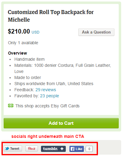
By default, Etsy shops feature social sharing buttons underneath “Add to Cart”. But keep in mind that, with lots of traffic, and many shoppers coming for specific items, they can afford it.
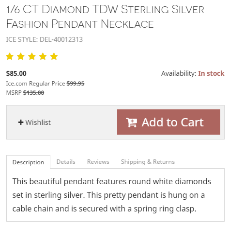
Ice.Com, a jewelry brand, maximizes whatever traffic they get by showing off a prominent call to action (we’ll talk about this more in #3) and a much more low-key wishlist button. And nothing else.
2. Experiment with longer / shorter product copy
For some products, it’s enough to have several paragraphs of copy on the page, and people will still pick it up. For example, a t-shirt doesn’t need an exhaustive description: a visitor doesn’t need a lot of information to know if they want it or not. Get a high-resolution photo, a paragraph or two about materials and print quality, and the piece will sell itself.
A more expensive item with many functions or features is a different beast entirely. For example, if someone wants to buy a laptop, or an e-reader, they will come to the page with lots of pre-conceived notions, after reading tons of reviews, and comparing different brands.
In that case, your copy needs to anticipate and answer their objections and concerns, remove as much risk as possible (by telling them about guarantees, reliability, return policy etc.), highlight all the main benefits, and make shoppers want your product more than the competing one.
You can’t hope to do all that and still have a nice, short page (unless you go for a product video).
No, to accomplish that goal, you need some detailed, compelling, and long-form copy.
Example: Onnit have extensive long-copy pages for their products. They know it’s tough to stand out in the fitness market, so they provide lots of helpful info as possible to potential buyers. Amazon is another signature example: it’s no coincidence that KIndle, their top-rated and best-selling product, has a very long-form product page.
3. Emphasize the main CTA
Sometimes the reason for low conversion rate is simple: your calls to action blend in, or vanish out of sight when visitors scroll down.
Here are just a few suggestions on how to make them instantly attention-grabbing:
- Use bright colors for the button - red and orange tend to work best (as shown by this case study, among others), with white font for button text;
- Increase the size of the call to action, and make the entire button clickable (you wouldn’t believe how many “Add to Cart” buttons I’ve seen where only the button text actually did something);
- If you can, make the call to action “sticky”, so it scrolls down with the visitor. This is very important if your page is long and your buy button vanishes out of sight quickly;
- In the copy, directly tell people how to find the button and click it to add an item to cart (surprisingly, it makes a difference - especially if your items are sold from a third-party site like Etsy or Amazon, where you have little control over the design);
- Speaking of the cart, make your “View Cart” button as easy to locate as possible. As long as the cart has something in it, the button needs to be big and bright.
Example: EntertainmentEarth.Com, the online store of Hollywood-themed action figures and collectibles, has some old-school-looking calls to action that could easily be improved for more conversions.
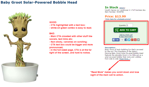
When selling niche items like action figures and collectibles, you can get away with a sub-optimal call to action. Still, there’s plenty of low-cost and effective room for improvement.
On the other hand, Little Sparrow Tea, a boutique tea store, goes for “less is more” approach with the call to action that is prominent, aligned close to the center of the page, and stays above the fold.
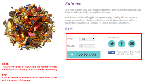
The only thing that seriously detracts from this product page is the clumsy Facebook Like button.
There are many ways to create a great conversion-centric call to action. Use the guidelines above for pointers, but in the end go with what works best for your brand.
4. Improve and customize your opt-ins
Remember: even if you have above-average conversion rates on your product pages, the vast majority of visitors will still leave without buying anything. They will close the website, or abandon the cart, and most of them won’t come back on their own.
That’s why opt-ins are your second most important way (after cart abandonment emails) to make potential customers return and buy something.
Trouble is, if your opt-in is static, placed in the sidebar or at the top, it won’t stand out and convert as well as it could.
To make sure that you generate more leads without wasting most of your traffic, here’s what you can do:
- Create dynamic opt-ins (like pop-ups) that show up to first-time visitors. People always complain about them, but research shows that pop-ups can double conversion rates (on average). Many brands we’ve worked with had great success using Privy (signing up gives you a free exit-intent pop-up, which is enough to get you started).
- Use exit-intent pop-ups to convert abandoning visitors and lead them back to your ecommerce brand to land additional sales (instead of letting a qualified lead slip).
- Tie email subscriptions to incentives like discounts, freebies, or special deals. Landing a subscriber and converting them into a first-time customer completely justifies a discount.
Example: Vintage Marquee Lights has several different opt-ins that appeal to different shoppers: those who can’t resist a freebie, bargain hunters, and others.
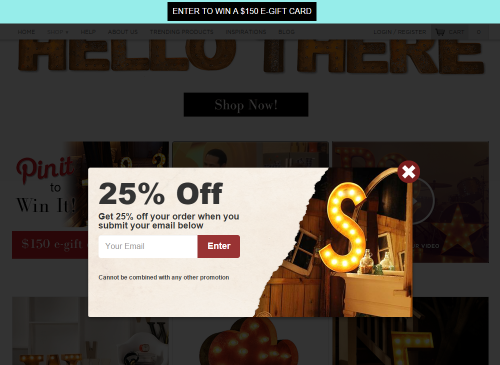
An opt-in bar at the top of the page and a pop-up offering a discount to
first-time buyers make for a high-converting combo.
Screw traffic, let’s test!
Despite being very simple, these tests can produce a big lift (50+ per cent) in your conversions, especially when done in combination with one another. They are based on well-known conversion rate optimization practices that reduce friction and result in more sales down the line.
Thanks to high-impact, heuristic nature of these tests, you will see the ROI much faster than with conventional A/B testing. And the best part is, you can implement them in very little time, with next to no investment. So no more waiting around wondering if you’re losing money!

