How To Use Heat Maps & Eye Tracking Software to Improve UX & Lift Conversion Rates
Feb 6th, 2017
Everyone says to follow the money...
But what you should be following are your customers' eyes.
In fact, not doing so means your site design likely includes some assumptions and guesswork that could be costing you attention and ultimately sales.
Keep in mind, the average digital consumer has an attention span shorter than that of a goldfish!
The barriers to entry have never been lower and competition has never been higher.
How then do you grab a customer's attention and how do you hold it longer? Is there a scientific way of studying how design elements can contribute to a good user experience and lead to sales conversions?
There sure is and it's why we created this piece for you.
Using eye tracking software, or heat maps, to add, eliminate, or reposition your site's elements optimally makes it possible to take much of the guesswork out of design.
In fact, these tools can often help you design a store that's guaranteed to convert better by making a few minor tweaks.
But first...
What's Old Is New Again
Some things just never go out of style...
Long before eye tracking caught the attention of digital marketers, researchers in the late 19th century observed that the human eye doesn't always read text from top to bottom
Today, subsequent research reveals that people largely scan the content on websites according to the following:
- They start in the upper left corner and read or look from left to right
- Their eyes then move down the page and make a second horizontal pass though one that is often shorter than the first
- Afterward, visitors often focus their attention on the left side of a page and move vertically (from top to bottom)
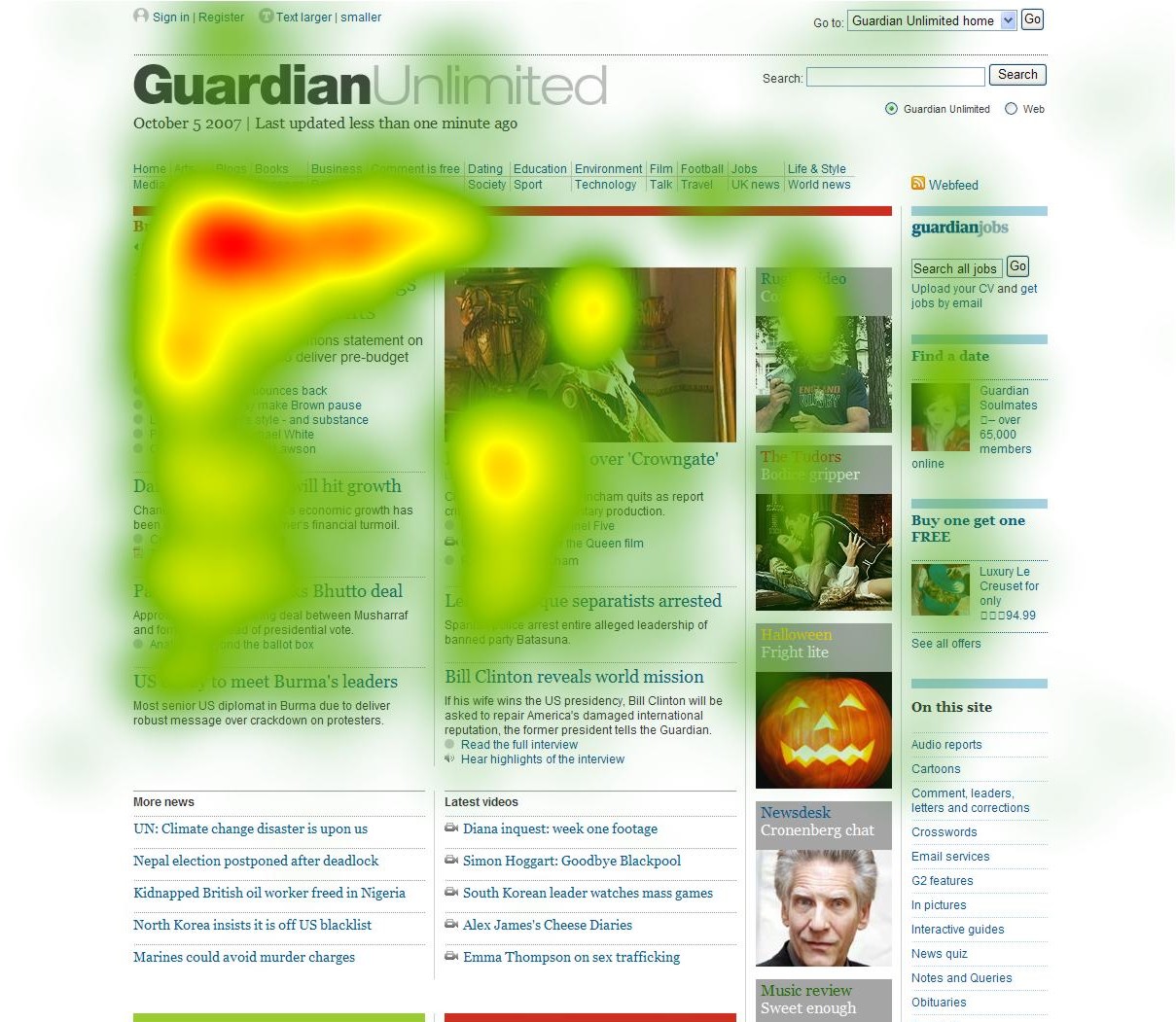
It's known as the F-pattern of observation and looks like this through the lens of a heat map or eye tracking software:

Image via: Nielsen Norman Group
Odds are this is how your site visitors initially navigate your page with their eyes.
But how can we be sure that this is always the case?
This is where eye tracking software can become a crucial element in your digital marketing repertoire. Identifying exactly where visitors are looking and how they visually navigate your site can remove much of the guesswork that may have gone into building your site.
Heat maps can show you unequivocally which site elements are grabbing eyeballs.
Heat maps are simply visual representations of the areas on a page where the human eye focuses most. The software, which is installed on your site and tracks a user's eyes, yields a map that illustrates where your visitors eyes are most focused:

Image via: MonetizePros
The various colors can offer you insight into the amount of time spent on each section. In this example:
- Red is where maximum time and attention is spent
- Yellow indicates slightly less attention is spent
- Green represents an even lesser degree of engagement or attention
NOTE: Here are ten highly rated heatmap or eye tracking tools you can use, including Hot Jar which allows Shopify Plus merchants the opportunity to track user behavior during the checkout experience so merchants can optimize and improve conversions.
Don't see a color in the above example?
That means visitors spent almost no time focusing on those areas.
Quick Note: Pay attention the next time you're on Amazon searching or shopping for something. Notice how the site often employs the F pattern when laying out its offerings and results to maximize attention and ensure you find what you're looking for.
Conversion Insights From Eye Tracking
The top left side and header are key...
The F pattern is real and something that can help guide your design and create a better user experience for customers.
But it's not the only thing that matters...
While the F pattern can help you understand where users are likely to look, you're not helpless when it comes to directing or influencing the eye. In fact, eye tracking software has revealed a handful of intelligent ways you can influence where users focus their eyes and attention.
It's possible to direct attention exactly where you want it.
Here then are three eye tracking insights you can experiment with and test to improve your site's UX and increase conversions:
Insight #1: Purposefully Use Images to Achieve Specific Objectives
It's a fierce debate...
The one that often flares up online regarding whether human faces draw eyeballs more than other design elements.
We can provide you data to back both hypotheses.
This post doesn't aim to settle the debate but rather help you better use the images we assume you're going to use regardless of what we tell you. Optimal design is all about understanding consumer psychology and leveraging it for better results.
Takeaway: Use images purposefully to achieve a business or conversion objective.
Instead of simply plopping an image on your site next to the text that contains your value proposition or CTA as in this image:

Image Source: Kissmetrics
Think strategically regarding what you want to accomplish.
Is your goal to get users to stare at the above baby's adorable face?
That's where attention is almost entirely focused. But if you're in the business of selling diapers, as is the site that included the baby's image, you can leverage the adorable baby's face to focus user attention on your value proposition:

Image Source: Kissmetrics
Take a moment to soak in the heat map's results...
By slightly turning the baby to look at the text the brand dramatically increased the attention focused on the text. Human beings subconsciously follow the gaze of other humans; it evokes curiosity and causes people to want to know what it is that's causing others to look.
Purposefully position your images or use them as directional cues to help accomplish your conversion goals. For instance, here's how Shopify Plus merchant MMA Warehouse uses an image to direct your eyes toward a product's value proposition:

Image via: MMA Warehouse
Insight #2: Leverage the Power of Asymmetry
Today's merchants are competing on experience...
With the commoditization of nearly everything, successful brands are using experiences to differentiate their offering even when there's little room for actual product differentiation.
Creating experiences often involves the arousal of emotion.
Often, today's shoppers are in a hurry. They lack the time to invest heavily in your well thought out site text; even if it was written by a professional wordsmith.
If a shopper is hurried, stressed, or otherwise feeling anxiety due to the speed at which they must make a purchasing decision (or overwhelmed by choice), help your visitors feel like heroes by helping them find what they want easily and cultivating a more positive mindset now that their problem is solved.
One way to do this is with asymmetric marketing.
In essence, asymmetry is choosing to stand out when it's safer to blend in.
What stands out to a shopper in a hurry is more likely to catch their attention and result in a purchase. In fact, research indicates the visual impact of an item can override a consumer's preference.
Which bicycle catches your eye:

Image via: Flickr
Unless you're color blind, the red bike caught your attention and drew your eyes more so than the hundreds of black bicycles in the room.
Allow this principle to influence your site's design.
For instance, the videos that are asymmetrical to other text-based search results garner an inordinate amount of attention in this example:

Image via: Kissmetrics
For example, Shopify Plus merchant Reshoevn8r leverages its more than 200,000 YouTube subscribers to improve its search results and garner attention:

Insight #3: Everything They Need & Nothing More
Less is often more in a world of overabundance...
Does your ecommerce store reflect this?
Too many design elements can overwhelm. Our 8-second attention spans are simply unwilling to take all of the time you might believe is necessary to comprehend your brand's value proposition.
Rather than order you to be a minimalist, search for this sweet spot; offer everything a user needs and nothing more.
For instance, user attention on the trucking site below is all over the map:

Image Source: TechWyse
The two elements that garnered the attention were the 'No Fees' element on top and the "Drivers" section on the bottom left. Unfortunately, neither of these elements contained a CTA that could've led people to click on what they found attractive and convert.
For example, Shopify Plus merchant Emazing Lights, which sells light glove sets to artists and performers, does a great job of simplifying its offering to direct attention to its CTA thus improving the chances users take notice and convert:

Image via: Emazing Lights
The idea is to provide only what people find valuable with just enough extra to persuade them to engage in the behavior you desire.
For instance, all of that supporting text you're so proud of writing is likely being ignored. For example, research indicates two thirds of those viewing the page below only scanned the text and often skipped many, or at least vast portions, of the introductions and subheadings we're often told are so important:

Image via: Nielsen Norman Group
However, notice the heat map reveals attention is often focused on the first two words of headlines.
Not much time at all to convince and convert, huh?
The Eye of The Beholder
A great user experience- one that also yields conversions- is in the eye of the beholder...
Fortunately, that eye is one you can track to reveal insights you can use to make adjustments to your site's design elements:
Remember, you've likely invested in a responsive site that offers a great experience regardless of device. Be sure to track user attention across devices and inside mobile applications to ensure your site design is optimal regardless of the screen on which it's being viewed.
Here are several tools you can use for mobile apps.
Want To Know The 15 Tools We Used To Generate Over $24 Million For Our Clients?
This past year, we have tested dozens of products to figure out which ones yield the best results.
Our toolbox contains some of the most impactful tools we found to grow a brand on Shopify.


