The Three Split Tests You're Not Running That May Be Costing You Sales
Nov 1st, 2016

You’ve seemingly done it all, right?
You’ve tweaked your CTA, changed the button color, varied the pricing, and tested different headlines just like you’ve read you should be doing to optimize your site and increase sales.
But you’re probably getting incremental results…
Nothing that’s materially changing your conversion rate.
Is this all you can achieve with split testing?
First of all, let’s dispel one major myth; the expectations you have about conversion rate optimization are likely way too high and influenced by the eye popping case studies that purport to reveal the secret to triple digit lifts.
The truth is most tests fail to move the needle in a large way.
Incremental gains, especially across multiple elements, can yield sizable cumulative results.
But what if you can nail a couple of elements that lead to dramatic improvements? What if you can find those small hinges that swing a big door? What if it’s the split tests you aren’t running that may actually be key in the conversion lift you’re after?
Here then are 3 A/B testing subjects often overlooked by ecommerce merchants- and how to begin implementing them today- that could reveal the insight necessary to boost conversions and grow sales:
Test Subject #1: Search Box Experience
Are you making your customers blind?
It’s certainly not intentional but busy ecommerce merchants often make it difficult to see, or find, their site’s offerings.
Customers come to your website to educate themselves or buy something…
That is if they can find what they want!
Not being able to search for and find what customers want often leads to big bounce rates.
So what can you do to improve the search experience so visitors can easily find and see your products or even discover, view, and consider other items on your site they previously hadn’t been aware of?
Reduce friction, shorten the path to purchase, and help your prospects and customers find what they’re looking for in fewer clicks by testing the following search box techniques designed to boost conversions:
Suggestion or CTAs in Search Box
Sure, you can test where to put your search box so it’s more prominent to visitors...
However, as shoppers become savvier they often know (1) there’s probably a search box somewhere and (2) it’ll take them a second or two to find it.
What else can you test that can move the needle?
Let’s look at most search boxes… they say “search” or are left empty:

This is a wasted opportunity to test ways to improve the customer experience…
Make your search box work harder by testing different versions of the text that appears in the box by suggesting items visitors can search for. For instance, you might suggest one of your highest converting or highest margin offerings in the box.
A product-specific suggestion:

Image via: Optimizely
Or consider displaying multiple products or categories that might inspire a search for something a visitor might not have previously thought of.
A suggestion that showcases the variety of products available:
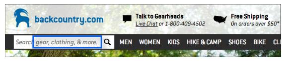
Image via: Optimizely
If you have a relatively large number of SKUs or offerings, consider a search box aimed at helping visitors filter your offerings.
Suggestions to help visitors narrow down the search and reduce purchase friction:

Image via: Optimizely
Be sure to test whether conversions improve by adding specific suggestions or filters or whether visitors are more likely to convert by inspiring them to discover your offerings on their own.
An inspirational CTA can tap a consumer’s innate curiosity:
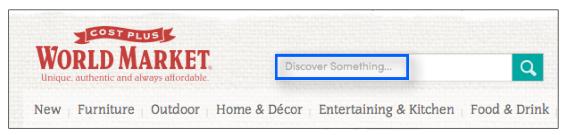
Image via: Optimizely
Test It: Test and compare search box suggestions, filters, and CTAs to see which search box attributes result in:
- More page views
- Purchase conversions
- Increase in average order values
An increase in AOV might indicate visitors are buying products not previously considered and result in design changes highlighting what could become future best sellers.
BONUS: Integrating machine learning that predicts what people may be searching for after just a few key strokes - just like Google does with its search box- may also improve the search process. Additionally, including common misspellings for popular search terms will also help visitors find what they’re looking for- especially those on mobile devices who are prone to typing with fat thumbs.
One more thought on site search...
Default “Sort By”
Are you unintentionally urging customers to leave your page?
If the search results page displays a large number of products, it can be overwhelming or even confusing for visitors – so much so that they might leave the site altogether.
Sorting search results can help visitors find what they want based on criteria they prefer, therefore shortening the time and number of clicks it takes to purchase.
“Sort By” functionality lists out criteria to organize search results.
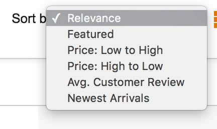
The default “sort by” criterion selected determines what shows up at the top when visitors see the search results. Based on what they see above the fold, they may decide if they want to continue browsing.
Test It: Test and compare various criteria to see which boost engagement and conversions:
- Relevance
- Bestseller
- Most popular
- Featured items
- New arrival
- Customer review
- Price
Your test results and conversion rate will guide you when determining which sort by categories to offer or whether using one as a default might result in increased conversions.
NOTE: Sorting by price may not make sense if the majority of your SKUs are priced identically. Similarly, if you have only a few products for sale it may not make sense to offer sorting at all.
Test Subject #2: Product Display
Are you visually flirting with prospects and customers?
Let’s cut to the chase; looks, especially in ecommerce, are important.
Since ecommerce is often a beauty contest that means you’re only as good as the images you display. The product images you choose must convince visitors to whip out their credit cards or your images are not going to win this beauty pageant.
How you display your product can materially impact conversion rates. It’s not only how your product images look, but also what kind of image display mechanism you use:
Visual Content Formats
Be sure to test new product image formats…
Even those that appear on the surface to make a lot of sense. For instance carousels or sliders can actually hurt conversion rates. In fact, some sliders result in a less than 1% CTR.
Not a good ROI for the amount of real estate they take up on your page…
Thankfully, there are other mechanisms for delivering visual content to showcase your products effectively, such as large static images, demo videos or 360° image views.
A demo video is a good choice if visitors can be better persuaded when they see the product in action:
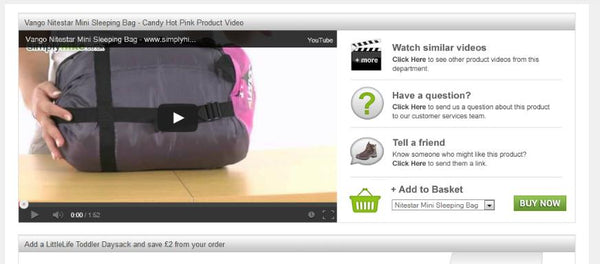
Image via: VMO
For instance, BottleKeeper, maker of a device that keeps bottled beer cold, safe, and fresh, wasn’t having much luck with the PPC ads it was running. Static images of the product weren’t effective in differentiating the BottleKeeper from products that were shaped similarly.
“Still images didn’t work for us,” Adam Callinan, the company’s co-founder, says. “BottleKeeper looks too much like a water bottle rather than a new category of product designed to keep an enclosed beer bottle cold and protected.”
That all changed though when Facebook launched its video advertising platform and positioned Callinan to better showcase BottleKeeper’s value proposition. “It was a game changer,” he says. “Video ads completely changed everything for us.”
Separately, site visitors often want to see a products from every angle.
A 360° view allows visitors to get a real life experience of the product while taking advantage of the higher conversion rate often associated with the use of large images that may be accessed from multiple vantage points.
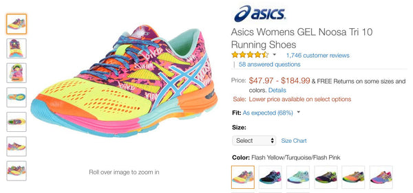
Image via: Amazon
Test It: Test different formats to showcase your products and see which method increases the time visitors spend on a particular product page to see which formats results in higher conversion rates.
Visual Content vs. Loading Time
Be careful…
While large images, product videos, or multiple images may boost conversion rates, they also have the potential to increase page load times.
Research suggests a majority of users expect a website to fully load within 2 seconds or less, and tend to abandon sites that take 3 seconds or longer to load.
Conversion rate decreases as load time increases:
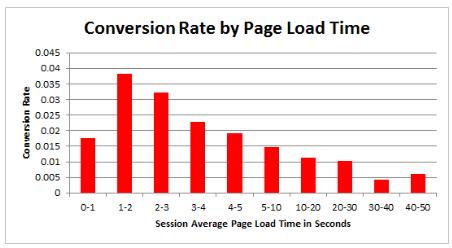
Image via: Econsultancy
Obviously, if your visitors run out of patience and abandon your site before they even start shopping, you won’t convert, earn trust, or boost sales. Remember, when testing product image formats to simultaneously monitor page load times.
Test It: Balance conversions resulting from videos, multiple 360-degree views, or large images with page load times. Or choose an ecommerce platform like Shopify that loads quickly regardless of product image format and doesn’t force merchants to choose between the two.
Test Subject #3: The Big Ideas (Don’t Forget ‘Em)
Start seeing conversion optimization as a system…
The majority of split tests fail - that is they fail to materially improve conversion rates (the key is to learn something and formulate another test). Those tests that “succeed” often yield only incremental improvements.
Remember, though all of these incremental changes can compound and add up.
However, it can be easy for ecommerce merchants focused on incremental improvements to overlook “big picture” questions that may offer more dramatic insights regarding conversion rates.
Your Messaging
Watch your language!
It sounds elementary, but your marketing message must be match for the demographic, psychographic, and your target market’s wants and needs.
You’re sure you’re talking their language, right?
Prove it.
Test your marketing messaging by being sure you know the Who, What, Why, How of your target market. Answering these questions, just as a journalist does, will help you uncover what’s truly relevant to your ideal customers and can help you craft messaging that inspires them to act as you desire:
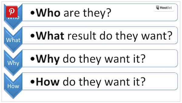
Image via: Search Engine Watch
When you gain insight into the larger picture that drives your ideal customers, you’ll better be able to fine-tune and create appealing content to boost conversions.
Test It: Get insights into your “Who, What, Why, How” by running a few PPC campaigns with different messaging and specific landing pages to track click-through rates and conversions:
- Identify the “who” by writing copy that appeals to different market segments
- Find out the “what” by offering different products
- Hone in on the “why” by testing brand voice and brand personality
- Nail down the “how” by tweaking the more granular details – e.g. low price vs. attentive customer service
Radical Redesign
How much does size matter when it comes to high performing landing pages?
You can easily find case studies in support of both short and long sales pages converting at materially higher rates. This is important to keep in mind, and test, especially when you’re testing single elements like images, CTAs, and button placement.
Remember, you can only tweak a page so much.
Your theme or landing page may have a shelf life in terms of conversion rate and may call for a redesign to reignite conversions - but you’ll only know by continually testing.
Radical redesign can be intimidating (despite the ease with which you can now change themes or throw up new landing pages in minutes, yet the potential upside is often worth the effort.
A radical facelift results in a 264% increase in conversion:

Image via: Neil Patel
Test It: Identify what you want to test on your new page and be sure you have enough traffic or you run the test long enough to obtain a representative sample split between the new & existing sites:
- Identify the “must-have” experience your customers desire
- Challenge the assumptions behind your current design
- Conduct customer surveys, use heat maps to identify patterns in user behavior, and incorporate analytics to identify and plug any holes in your funnel
Be sure you have a simple hypothesis or theory you want to test and allow the data to dictate future tests and hypotheses.
Your Turn
Don’t leave money on the table…
The insights from the three aforementioned split test subject areas can help you make key determinations about your search box, product image formats, and site design that can materially increase your conversions and sales.

Want To Know The 15 Tools We Used To Generate Over $24 Million For Our Clients?
This past year, we have tested dozens of products to figure out which ones yield the best results.
Our toolbox contains some of the most impactful tools we found to grow a brand on Shopify.